

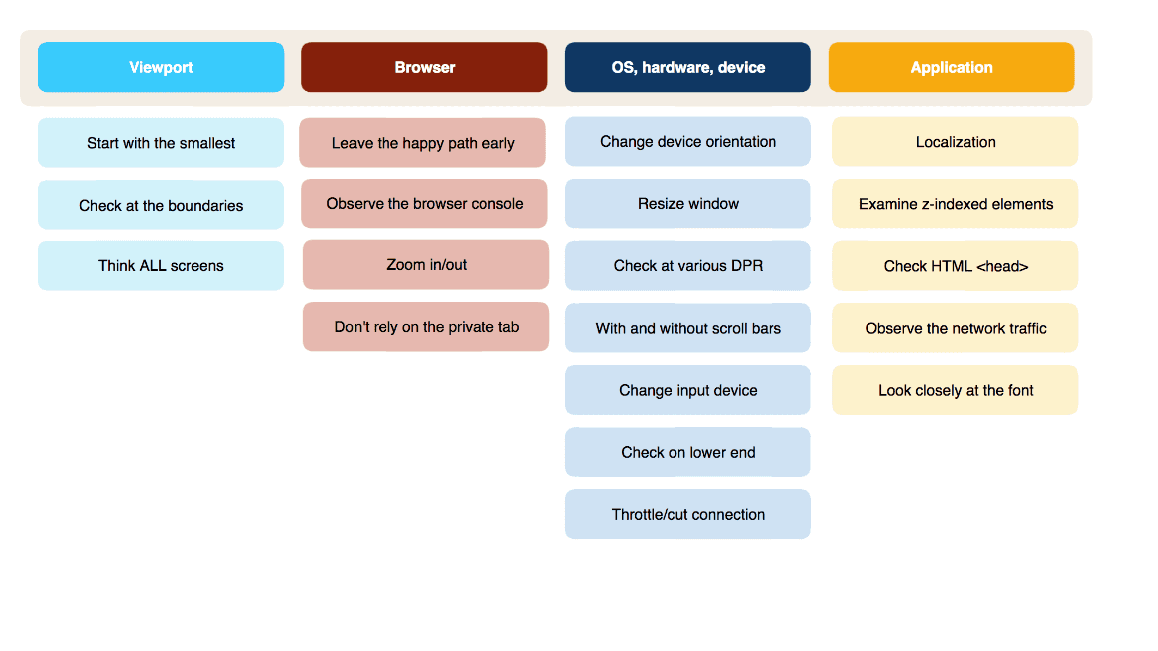
It can be quite challenging to test web applications that are built by using the responsive web design [1] (RWD) approach. This heuristic is designed to help anyone involved in that. Some test heuristics come with a mnemonic – which in this case is VIP BOA, representing the four main categories VIewPort, Browser, OS, Application. Here is the cheat sheet, followed by a detailed description for each of those categories. Happy testing!
Viewport size
Start with the smallest
Take a look at the minimum viewport width your application supports. And then start testing there. You will be amazed at how many issues that uncover: Headlines not fitting, elements overlapping, etc. People are often surprised by these issues: They are using current devices for testing which tend to have quite big displays and therefore totally forget to cater for the smallest supported display. To give an example: Let’s say the minimum viewport width supported by your application is 320px. Exclusively designing and testing with current mid-range Android and iOS devices in mind (360px – 375px) would most probably lead you into the trap described above. You should definitely make your team aware of this topic to prevent design and/or implementation flaws in the first place.
For a quick check, you could always use the developer tools of your browser. This way, you can set the viewport to the exact desired size. It is only a matter of a few clicks in most developer tools (e.g. Chrome, Firefox and Safari). [2]
Check at the boundaries
You should always have boundary analysis in your tool-belt when testing something. And you can also apply it in this context: Look at the viewport ranges/breakpoints that are defined by the media queries in your application. Then set your viewport to the min/max values of these ranges and start testing respectively.
To give you a practical example, let’s pretend your application’s media queries define the following viewport ranges:
- 320px – 480px
- 481px – 767px
- 768px – 991px
- 992px – 1199px
- >= 1200px
This would mean you would have to set the viewport width to 320px and test. Then set it to 480px and test. Set it to 481px and test – set it to 767 and test – set it to 768 and test – and so on.
The Chrome Developer Tools provide an excellent interface [3] that speeds you up in that process. It displays the viewport ranges based on the media queries defined in your application and allows for easily setting the viewport width to their minimum and maximum values.
Think ALL screens
Responsive web design is not only about small screens, but also about all screens.
Remember, a desktop user is always able to resize their browser window to just 400px width, even on a 1920px wide display. Also, think of “new” device classes: There are desktop devices out there that come equipped with a touch screen, breaking up with the classic dichotomy between “desktop/click” on the one hand and “mobile/touch” on the other. When creating concepts and designs, always keep in mind that your design canvas is being reduced vertically by browser chrome (i.e. address bars, buttons) in the real world. Not to forget the software keyboard that appears when in an input form. Also, take care of that headline copy that is looking gorgeous on your 1920px wide display: Does it fit on a 320px screen as well? And is this also true for the French translation, which might consist of more characters?
Do not focus on either small screens or large screens and do not make false assumptions. Responsive web design is here to cater for all.
Browser
Leave the happy path early
Carefully choose the browsers in which you are doing your first rounds of tests.
The first one should meet each of the following three criteria: It has a large share among users of your application AND it is the preferred browser of the developers in your team AND it is considered as being “modern”. Opinions on what makes up a modern browser differ, so you may want to check an objective and timeless proposition [4]. By doing your first round of tests only in this one browser you have a high chance to uncover actual issues/gaps in the implementation (and not just some cross-browser problems).
After that, leave the happy path immediately. Pick the browser for your second round of test, which only has to meet two criteria: It has a large share among users of your application AND it is notorious for quirkiness. Then start testing there. With the findings from your tests in the previous browser, you can now easily identify cross-browser issues. It is valuable to know these issues at such an early stage. On the one hand, because this gives your team the chance to assess whether fixing these issues requires bigger changes in your application. On the other hand, because you only have to retest in a few browsers after the early issues have been fixed. Imagine the mess your team would face if the bad browser were tested last. You would have to fix all the issues and retest the fixes in all the other browsers.
The next browser pick should meet again two criteria: It has a large share among users of your application AND it runs on a device-class different than the previous browsers. For example, if the previous two test rounds have been executed on desktop devices, a small screen touch device will be a good addition.
After that, iterate through all the other browsers.
This risk-based approach is inspired by the article “High-Impact, Minimal-Effort Cross-Browser Testing” on Smashing Magazine [5].
Observe the browser console
Errors in the browser console might not have a visible effect while testing an application, so they go unnoticed way too often. Maybe an error is being thrown for a certain part of your application, but you do not notice that because you are actively testing something else or the error just does not have a visible impact. But errors are not the only things you should care for: Maybe a warning is being thrown because a component or API call has been deprecated and you will need to adjust something in your application. Therefore, it is highly recommended to always keep an eye on the browser console (pick the most verbose log level). And that goes for every browser your application supports.
Zoom in/out
Zooming in and out a page is basic browser functionality. It is for example there for users who casually need to increase the font size, but you could also use it to quickly check for page layout issues. The keyboard shortcut is the same across (desktop) browsers: Use CMD + on Mac (or CTRL + on Windows) to zoom in. Use CMD/CTRL – to reverse and CMD/CTRL 0 to reset the zoom level. While doing this, observe the UI of your application. All elements should scale proportionally. If this is not the case, the outliers may point you to an implementation issue.
Do not rely on the private tab
It is a good idea to do your tests in a private or incognito tab: This frees you from having to manually delete cookies and clean browser cache before every test. Plus, it switches off all browser extensions that might interfere with your application. However, do not forget to take the real world into account. Nowadays, many people are using extensions that are blocking ads or web analytics requests (popular examples are Adblock Plus and Ghostery). You might be interested to see how your application behaves with such extensions. Apart from obvious effects (ads are not displayed, web analytics is not working), they might as well introduce unwanted side effects, like editorial content not being displayed, web fonts not being loaded, or pages being displayed with visual defects.
OS/hardware/device
Change device orientation
If you are testing on a device that supports device rotation, always check whether this works properly. It is also worth rotating the device in the middle of a use case, regardless of whether the use case is small or large. There are some devices out there (like the Google/Asus Nexus 7 [6]) with a screen aspect ratio that leads most RWD applications to display the handheld view in portrait orientation and the tablet view in landscape orientation. You definitely want to get your hands on one of these devices.
Resize window
There are several ways to change the browser window size. On iOS devices, you can adjust your browser to share the screen with another app. On desktop devices, you can snap the window to half the screen size or just maximize to full screen with one click. And there is, of course, that classic way of window resizing: Just by dragging the edge or corner of the window. This one is an interesting gesture with regards to this heuristic. It is because, while doing this, the application has to continually re-calculate what to display. You might observe some issues when doing this in your application (e.g. elements flickering or jumping).
Check at various DPR
DPR stands for “device pixel ratio” [7], which is the ratio between physical pixels and CSS pixels. Next to the viewport size, this is the second parameter determining the UI behaviour of a typical RWD application. But DPR not only affects the UI behaviour: If your application makes use of responsive images, it lets the browser display different image files depending on the DPR. To give a simple example, it is possible to define one image file per DPR, let’s say a 100×100 image for DPR 1, a 200×200 image for DPR 2 and a 300×300 image for DPR 3. A classic desktop display with DPR 1 would display the 100×100 image. An iPhone 7 (DPR 2) would display the 200×200 image – and an LG Nexus 5 (DPR 3) would display the 300×300 image.
I would recommend having one screen per common DPR at hand. Take a look at your application on these screens, especially at the images that are displayed. It can be hard or impossible to spot the difference between DPR 1, 2, 3 and 4 images. In such cases, inspect your application in the browser’s developer tools. The network tab lists the image files that have actually been requested by the browser.
Some examples for devices with common DPR values:
- DPR 1 – Common desktop display
- DPR 2 – iPhone 7, iPad Air 2, MacBook Pro with Retina display
- DPR 3 – LG Nexus 5
- DPR 4 – Samsung Galaxy S7
It is also possible to simulate DPR 1-3 in Chrome Developer Tools, which works really good. Or, if you have a Retina MacBook and an external DPR 1 display at hand, you can easily switch between DPR 1 and 2. Keep in mind that you always have to reload your application after having switched to another DPR.
With and without scroll bars
You always should check your application with and without scroll bars – and here is why: Some operating systems display scroll bars, some do not. Others, like macOS, leave that decision to the user. And even more, depending on the OS, a browser may or may not take scroll bars into account when calculating the viewport size. So, the application renders slightly different across operating systems.
When it comes to the application itself, you may for example observe a scroll bar suddenly appearing because more content is being displayed on a page – causing your UI to flicker or jump. This would not be an error though. In some cases, however, scroll bars can indicate issues in your app: For example, if there is more than one scroll bar displayed. Or if a scroll bar indicates a really large page while the page content is actually short. Or if a horizontal scroll bar appears but it should not.
For a quick test, there are several options: If you are on a Mac, you could simply switch scroll bars on and off in the system preferences. If you are on a Windows machine, you can switch scroll bars on and off in the Developer Tools of Chrome by setting the device type either to “Desktop” (scroll bars) or “Mobile” (no scroll bars).
Change the input device
Starting with the era of “personal computing”, the most common input devices have probably been the keyboard and the mouse as a pointing device. Complemented by the touch screen during recent years, these can be considered most popular. But there are others you might not think of immediately, like a TV remote controls. Also, pointing devices are available in several flavours: Mice with or without scroll wheels, trackpads, trackballs, styluses and Apple Pencils etc.
At least have a wheel mouse, a trackpad and a touch screen at hand. The touch screen can be of course part of a mobile device. Then go and check that all the touch and mouse gestures are translated into the desired actions. For example, it could be that scrolling through your application works perfectly fine when using it on a MacBook with a trackpad, while scrolling with a wheel mouse takes forever. Just blow the dust off that cheap wheel mouse, plug it in and check it. And last but not least, do not forget about the keyboard! People with disabilities may depend on the keyboard. Not to forget about many others who use the keyboard to speed up their work.
If you lack a touch device or want to do a quick check, you can simulate touch events in the Chrome Developer Tools. However, keep in mind that this is by no means 100% comparable to a physical touch screen, so it is a good idea to always have at least one touch screen device available.
Check at the lower end
Many people in developed countries own quite current mobile devices. However, keep in mind that some do not follow the typical 2-yearly renewal cadence. Others simply just buy used devices and they might still have a current OS version on it. For example, at the time of writing this, an iPhone 5s (released 2013) is still compatible with iOS 11 (released 2017). Another topic is screen size. Even though mobile device displays tend to get bigger, Apple for example still offers the iPhone SE with a 320px widescreen.
Just grab the oldest device you can get that is OS-wise still supported by your application. Does your application feel “smooth” on that device? Observe the UI when scrolling and switching between portrait and landscape. Observe animations, if there are any. Observe the time between your input and the response of your app.
Throttle/cut connection
A network connection is of course essential for a web application. Keep in mind that your application will be consumed by users on the go with rather slow connections. So, you definitely want to try out how your application behaves with both a slow connection and no connection. By throttling it you can properly see whether some kind of loading indicator is implemented and if it works okay. By switching off the connection you can check how robust your application is in case a request cannot be made, e.g. whether it displays a proper error message in this case.
For a quick test, Chrome Developer Tools allow for easily simulating a slow or unavailable network connection. If you like to test on a throttled connection in other browsers and on mobile devices, use a proxy application like Charles [8]. Charles also comes in handy when you want to view the network traffic across browsers and devices.
Application
Localization
If your application is being localized, try to get all the translations as early in the implementation stage as possible and have them displayed in your application. This is because you would want to test several things: Do all the copies for headlines, navigation items and buttons fit? Do they even fit on a small screen (for example, French copy is known to be longer than English copy)? Do your fonts contain all the characters necessary?
In case the translations are not there yet, consider mocking these up by using dummy text generators like lipsum.com. [9]
Examine z-indexed elements
The z-index CSS property [10] determines how overlapping elements are ordered on the z-axis. This is basically defined by setting an integer number for the desired element. There’s no mechanism in place that guides in assigning the right value or that prevents assigning the same value to several elements. And even if you never assign the same value twice, there’s the chance to introduce unwanted behaviour – because it’s hard to keep an overview of all the already existing elements and their z-index values. So, if you are building a web application from scratch and you need to use z-index, you will most probably run into issues. This is why I decided to include z-index as a dedicated topic here, even though it is not directly related to RWD.
What can go wrong? Let’s start with the easy one first: It might not work at all, i.e. elements meant to overlay others just do not overlay them. Or background elements might bleed through an overlaid element (this often happens when your application features a sticky header). A problem revolving around modal windows is “scroll-bleed”. It means that scrolling through a modal does not work, instead of scrolling the modal content, the background is scrolled. You might also experience that, when having clicked an element inside a modal, the click is actually being received by an element in the background.
Check HTML
Theelement [11] is a central piece of your application, however many things defined there are as such not directly visible for a user of your application. For example, it provides important configuration such as character encoding, rendering behaviour and references to CSS and scripts. Not to forget about the page title, description and keywords. Furthermore, it can hold references to a plethora of icons (the favicon is only the simplest one possible) and information to be displayed on social networks like Facebook and Twitter when an URL of your application is being shared there. Whether your application is “mobile-web-app-capable” is determined by tags inside theelement as well.
content, so missing script references in theelement do not necessarily indicate a problem. If your application supports versions of Internet Explorer before 11, you should consider having theelement inside yourelement. It is also recommended to have a favicon, but it has not necessarily to be referenced in the. You are easily able to spot a missing favicon by just looking at the current tab of your desktop browser. Anyhow, that whole favicon topic got a bit more complicated over the last years, so let’s take a closer look.
The classic minimum requirement for a favicon is still valid. You could just put a 16×16 favicon.ico file in the root folder of your application (or define another folder in the) and you are done. However, this would not cater for many use cases: Internet Explorer needs a separate definition for bookmarks. iOS needs separate files in various resolutions that are used when users bookmark a URL on their home screen. This goes similarly to Android. Safari on macOS needs a separate file for pinned tabs. And Windows 8 and 10 need another one that is being used when users add a shortcut for your application to the start menu. For the complete picture, please take a look at this excellent Favicon Checker. [12]
Regarding meta information for social networks, it is also quite hard to get it right. Different formats are enhancing defined by Facebook and Twitter, which not only require texts but also images in certain dimensions. So, it could easily happen that you have all elements defined, but for example, the image has the wrong dimensions. And once you shared your application URL, the shared information might be cached really long (at least this is the case with Facebook). That means that even if you applied necessary changes, they might not be immediately visible on Facebook – and this can be really confusing. It is therefore recommended to use the Facebook Sharing Debugger [13] – it not only allows for checking the content of your meta information but also lets you invalidate the information Facebook caches about your application.
A lesser-known metatag is the Apple-specific “apple-mobile-web-app-capable” (and the Androidspecific equivalent “mobile-web-app-capable”). If it is configured properly, you can try it out like so: Open your application in Safari and use the “Add to home screen” functionality. This creates a shortcut icon to the application URL on the home screen. If you then use that shortcut, your application will open in the browser – but without all the browser chrome-like address bar and back/forward buttons. So, if your application is mobile-web-app-capable, you should check whether your application could still be used without those back/forward buttons provided by the browser.
That has been a lot of information. For a quick check, always have a look at theelement in the HTML file and at the current browser tab. For checking all that advanced favicon fancy, you could use the Favicon Checker [12] mentioned above (the same page also provides a favicon generator). To check whether there is valid meta information for social networks and to preview it, Facebook and Twitter provide the right tools (Facebook Sharing Debugger [13], Twitter Card Validator [14]). Keep in mind that these only work with publicly available URLs.
Observe the network traffic
Your application most probably references to other resources that are requested as soon as your application URL is being opened in the browser. And there might happen further requests to more resources while your application is being used. These can be styles, scripts, fonts, images, web analytics requests etc.
It can happen that downloading or requesting these resources does not work and you may not notice that by just looking at the UI of your application. Good examples are server requests generated by a web analytics solution, which you can only see in the network traffic. So, you should always keep an eye on the network tab of your browser. Also, you could try blocking certain requests to see how robust your application is. For example, block images to see whether a placeholder is displayed. Or block fonts to see how your application looks with the fallback font being rendered.
While checking the network tab, you would also want to look for things like duplicate requests, unwanted redirects, requests that run into errors (like 500, 403, 404, …) and timeouts, un-minified Javascript/CSS files and responsive images not being loaded correctly (e.g. the bigger file size is requested). Also, keep in mind that your application will be consumed by users that are on the go with a rather slow connection and a mobile data plan. So, watch out for single big files and the overall application size. And keep an eye on the number of requests being made.
The Chrome Developer Tools network tab [15] has a very nice summary for the overall number of requests, overall file size and load time. When it comes to testing web analytics, the developer tools of all modern desktop browsers do a good job in displaying all parameters appended to a web analytics request URL in a human-friendly format. And for blocking requests, you could use Chrome Developer Tools or a proxy like Charles.
Look closely at the font
Not a long time ago, web pages were using pre-installed fonts to render. Headlines were may be displayed as images. Then came web fonts, enabling a whole lot of design possibilities. Many web applications nowadays are using web fonts. A good practice is to define a fallback font, which is used in case the primary font cannot be displayed.
It is sometimes hard to spot the differences between the primary font and fallback fonts. So, make yourself familiar with the differences and details and if in doubt, ask a designer from your team. OS-wise, some older Android versions often have problems with loading web fonts. It could also be that certain characters are missing in the font, so you would want to test for that in at least the languages your application supports. It could also be that only single parts of your application display the primary font, while others do not. You should also check that the fallback scenario works: Block the primary font from being loaded and see whether the texts in your application still look acceptable and how your application UI behaves.
References:
- https://en.wikipedia.org/wiki/Responsive_web_design
- Chrome:https://developers.google.com/web/tools/chrome-devtools/device-mode/emulate-mobileviewports#responsive_mode
- Firefox: https://developer.mozilla.org/en-US/docs/Tools/Responsive_Design_Mode
- Safari: https://support.apple.com/kb/PH26266?viewlocale=en_US&locale=en_US
- https://developers.google.com/web/tools/chrome-devtools/device-mode/emulate-mobile-viewports#media-queries
- http://farukat.es/journal/2011/02/528-modern-browser/ https://www.smashingmagazine.com/2016/02/high-impact-minimal-effort-cross-browser-testing/
- https://en.wikipedia.org/wiki/Nexus_7_(2013)
- https://developer.mozilla.org/en/docs/Web/API/Window/devicePixelRatio
- https://www.charlesproxy.com/
- http://lipsum.com/
- https://developer.mozilla.org/en-US/docs/Web/CSS/z-index
- https://developer.mozilla.org/en-US/docs/Learn/HTML/Introduction_to_HTML/The_head_metadata_in_HTML
- https://realfavicongenerator.net/favicon_checker https://developers.facebook.com/tools/debug/sharing/
- https://cards-dev.twitter.com/validator
- https://developers.google.com/web/tools/chrome-devtools/network-performance/reference

Marcus Noll
Marcus Noll - is Senior Software Engineer (Solution Architecture), NEW WORK SE, Hamburg, Germany. He has over six years of QA engineer experience in the field of responsive web design, building, and leading a small QA team. Thrilled by the fast-paced world of web frontend development. Father of two. Marcus all kinds of weird music, but also has a big heart for certain mainstream stuff. Contact Marcus via XING - https://www.xing.com/profile/Marcus_Noll3/cv